Tutorial: Create a CSS and SVG powered, real looking Map
Scalable Vector Graphics, short SVG, are powerful XML based vector graphics. Unfortunately SVG isn’t 100% supported by all browsers, but the most modern browser support the most things, except the Internet Explorer (what a coincidence!). You could get an clear overview on caniuse.com of the SVG-browser-support. If you combine the power of CSS and SVG you could create awesome effects like a 3D looking maps without plugins, when your browser support it. I created the map with Firefox 3.6, but it works also ongoing with Firefox 3.5 (Gecko 1.9.1). Sadly I don’t get it work in WebKit, it seems to be a bug that WebKit don’t work with SVG powered CSS masks. There exists a property for CSS mask: -webkit-mask(-image) but there is no working example online, just a screenshot example in the WebKit Developer Blog.
Create the XHTML markup
<!DOCTYPE html PUBLIC "-//W3C//DTD XHTML 1.0 Transitional//EN" "http://www.w3.org/TR/xhtml1/DTD/xhtml1-transitional.dtd">
<html xmlns="http://www.w3.org/1999/xhtml" xmlns:svg="http://www.w3.org/2000/svg">
<head>
<title>Google Maps Demo</title>
<meta charset="utf-8" />
</head>
<body>
<div id="wrapper">
<div id="map-wrapper">
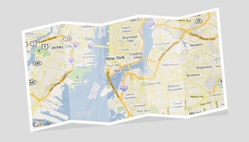
<div id="map"><img src="https://maps.google.com/maps/api/staticmap?center=Brooklyn+Bridge,New+York,NY&zoom=12&size=640x340&maptype=roadmap&sensor=false" alt="Google Maps" /></div>
</div>
</div>
</body>
</html>
I used a map from Google Static Maps for this example, you could get an overview about the different parameters and an instruction of it in the Google Static Maps API Docs.
Note: For Google Static Map you don’t need a Maps API key.
Add CSS(3) and (inline-)SVG to your code
body {

    background-color: #dddddd;

    padding: 50px;

}


#wrapper {

    width: 700px;

    margin: 0px auto;

}


#map-wrapper {

    width: 660px;

    height: 360px;

    -moz-transform: rotate(-5deg);

    -webkit-transform: rotate(-5deg);

    -moz-box-shadow: inset 0px -20px 0px rgba(180, 180, 180, 0.4);

}


#map {

    background-color: #ffffff;

    width: 640px;

    height: 340px;

    padding: 10px;

    clip-path: url(#clip-outer);

}


#map img {

    background-color: #000000;

    mask: url(#mask);

    clip-path: url(#clip-inner);

}
The most CSS code should be no problem for advanced CSS coders. The -moz-transform/-webkit-transform property rotates the #map-wrapper element to -5 degrees. -moz-box-shadow creates the map shadow to give the map an additional deep. clip-path properties referencing the SVG clip-path-polylines and mask the SVG mask.
Now we could add the inline-SVG code:
<svg:svg>

    <svg:mask id="mask" maskUnits="objectBoundingBox" maskContentUnits="objectBoundingBox">

        <svg:rect x="0" y="0" width="20%" height="100%" fill="#eeeeee" />

        <svg:rect x="0.2" y="0" width="20%" height="100%" fill="#cccccc" />

        <svg:rect x="0.4" y="0" width="20%" height="100%" fill="#eeeeee" />

        <svg:rect x="0.6" y="0" width="20%" height="100%" fill="#cccccc" />

        <svg:rect x="0.8" y="0" width="20%" height="100%" fill="#eeeeee" />

    </svg:mask>

    <svg:clipPath id="clip-outer">

        <svg:polyline points="0,20 138,0 266,20 394,0 522,20 660,0 660,340 522,360 394,340 266,360 138,340 0,360" />

    </svg:clipPath>

    <svg:clipPath id="clip-inner">

        <svg:polyline points="0,20 128,0 256,20 384,0 512,20 640,0 640,320 512,340 384,320 256,340 128,320 0,340" />

    </svg:clipPath>

</svg:svg>
The #mask element attributes are based of the relative width and height of the referenced element (in this case #map img). All mask-rects (5 rects) have a width of 20% and are have 100% height related to the referenced element. The x-attribute is every time 0.2 higher from rect to rect, that the last element (width 20% = 0.2) has an end width of 100%. The color changes from rect to rect to simulate the folded map.
Now we are nearly finished, we just have to clip the borders with SVG clip-paths. The #clip-outer clips the border of the white (background) wrapper and #clip-inner of the image map itself. The clip-path is based on a polyline/polygon, the first number represents the y-, the second number the x-position and the space between the two numbers separates the particular x/y position of the points.
Additional notes
The document has to have the "real" XHTML header: "Content-Type: application/xhtml+xml" to work. Also this currently just works in Firefox, if you have any idea how to get this work in other browsers, let me know it! If you need addition resources/information about that topic, visit Mozilla Developer Center: Applying SVG effects to HTML content.

 Would you like to follow BWF or like it? Click here!